To customize how the document form looks when viewing or editing documents, you
can configure the collection’s default document view UI options (Collection
settings -> Version settings tab):
{
  /** Use the full width of the main panel content. */
  "fullWidth": true,
  /** Always collapse the primary sidebar (like it does on mobile). */
  "alwaysCollapsePrimarySidebar": true,
  /**
   * Responsive root layout. Keys are CSS media feature expressions.
   * See [Responsive root layout](#responsive-root-layout) below.
   */
  "rootLayout": {
    "(min-width: 65rem)": [],
    "all": []
  }
}
A layout is an array of nodes that controls how fields are arranged inside a
Struct. Each node is either a Field Node (renders a schema field) or a Div
Node (a container for other nodes, basically a simple AST for an HTML
<div>).
If no layout is provided for a Struct, Superego renders its fields in the order
they appear in the schema, stacked vertically.
A Field Node references a property in the schema and renders it.
{
  /**
   * Required. Path to a property in the schema (e.g. "myProp", "myList.$",
   * "myList.$.myProp").
   */
  "propertyPath": "myProp",
  /** Nested layout. Only applies to Struct fields. */
  "layout": [],
  /**
   * Hides the label section of the field. Defaults to false. Warning: the label
   * can contain controls (e.g. "nullify" or "add" buttons).
   */
  "hideLabel": false,
  /**
   * Whether the field can be collapsed. Only applies to Struct and List fields.
   * Defaults to true.
   */
  "allowCollapsing": true,
  /**
   * Makes the field flex-grow its height to fill all available space. Defaults
   * to false.
   */
  "flexGrow": false
}
A Div Node is a generic container. Use it to group fields and apply CSS
styles, for example to create multi-column layouts with flexbox.
{
  /** CSS properties (same as React's CSSProperties). */
  "style": {},
  /** Nested layout nodes. */
  "children": []
}
Superego sets a few CSS custom properties on the document form container. You
can reference them in Div Node style values via var(...).
/**
 * Height of the visible area in which the document form is rendered. Useful for
 * defining "sticky" layouts.
 */
--visible-area-height

/** Distance from the top of the viewport to the top of the visible area. */
--visible-area-top

/** Standard vertical gap to use between sections. */
--section-vertical-gap

/** Standard horizontal gap to use between sections. */
--section-horizontal-gap

/** Standard vertical gap to use between fields. */
--field-vertical-gap

/** Standard horizontal gap to use between fields. */
--field-horizontal-gap
rootLayout is an object whose keys are
CSS media feature expressions
and whose values are layouts. At runtime, the first matching expression wins
(evaluated in insertion order).
Use "all" as a catch-all fallback (it always matches). Place it last so that
more specific expressions are checked first.
| Key | Meaning |
|---|
"(min-width: 65rem)" | Matches when the viewport is at least 65rem wide |
"(min-width: 45rem)" | Matches when the viewport is at least 45rem wide |
"all" | Always matches (fallback) |
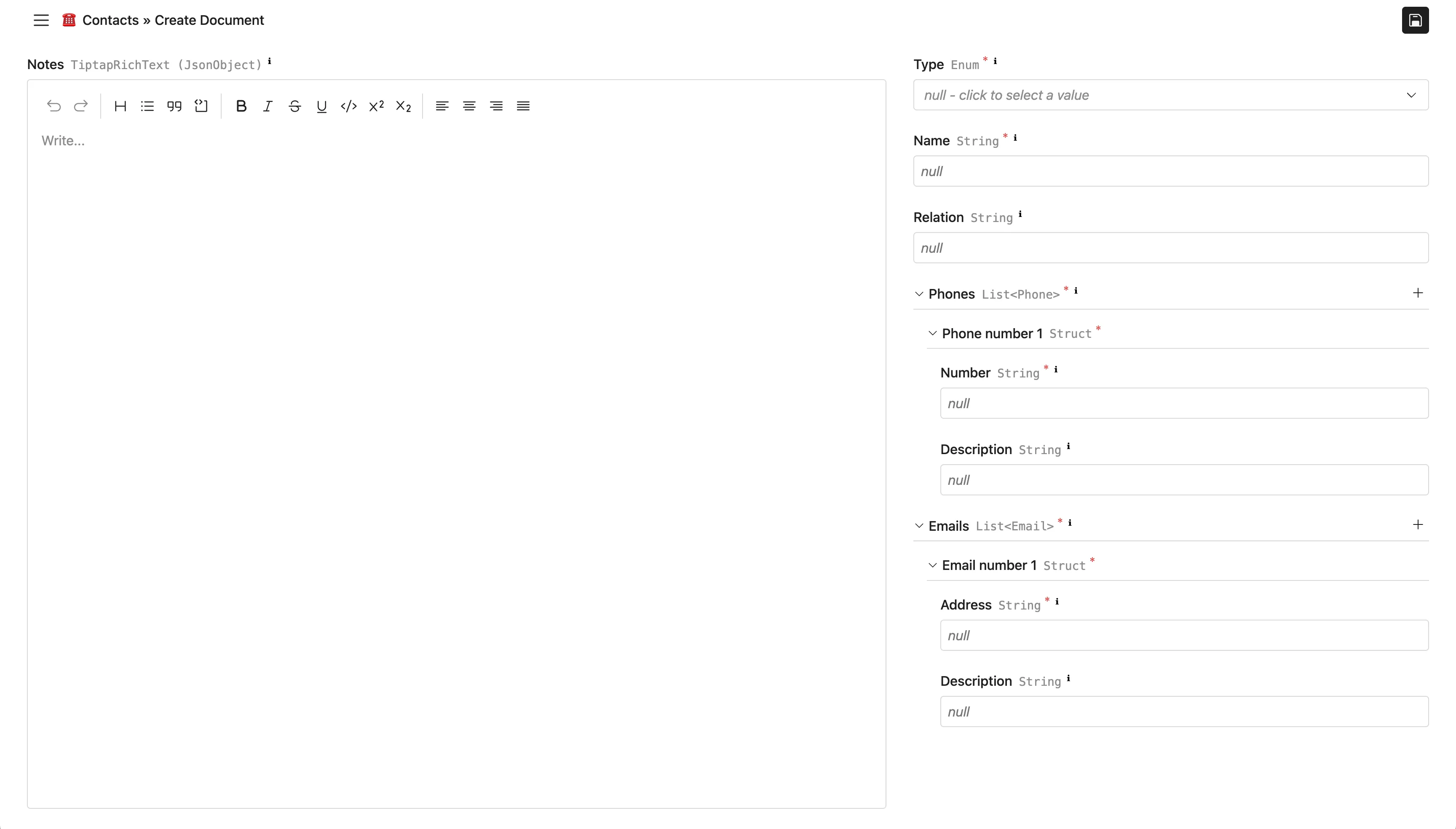
A responsive two-column layout: on wide screens the left column is a sticky
notes editor and the right column lists the remaining fields. On narrow screens,
all fields are stacked vertically.
{
  "fullWidth": true,
  "alwaysCollapsePrimarySidebar": true,
  "rootLayout": {
    "(min-width: 65rem)": [
      {
        "style": {
          "display": "grid",
          "gridTemplateColumns": "5fr 3fr",
          "columnGap": "var(--section-horizontal-gap)",
          "height": "100%"
        },
        "children": [
          {
            "style": {
              "position": "sticky",
              "height": "var(--visible-area-height)",
              "top": "var(--visible-area-top)",
              "display": "flex",
              "flexDirection": "column",
              "gap": "var(--field-vertical-gap)",
              "minWidth": 0
            },
            "children": [{ "propertyPath": "notes", "flexGrow": true }]
          },
          {
            "style": {
              "display": "flex",
              "flexDirection": "column",
              "gap": "var(--field-vertical-gap)",
              "minWidth": 0
            },
            "children": [
              { "propertyPath": "type" },
              { "propertyPath": "name" },
              { "propertyPath": "relation" },
              { "propertyPath": "phones" },
              { "propertyPath": "emails" }
            ]
          }
        ]
      }
    ],
    "all": [
      { "propertyPath": "type" },
      { "propertyPath": "name" },
      { "propertyPath": "relation" },
      { "propertyPath": "phones" },
      { "propertyPath": "emails" },
      { "propertyPath": "notes" }
    ]
  }
}
Result (wide screen):